[Python] 데이터 시각화 - PLOTLY
데이터 시각화 - PLOTLY

0. plotly
- 인터렉티브한 그래프를 그릴 수 있는 라이브러리입니다.
- dict 형식으로 명령어를 작성합니다.
- 다양한 방식으로 export가 가능합니다.
- 한글 폰트를 기본으로 지원해줍니다.
plotly에서 그래프를 그리는 방식은 여러가지가 존재합니다.
그래프를 그리기 전에 plotly에서 일반적으로 사용하는 패키지들을 모두 불러와줍니다.
import plotly.io as pio # Plotly input output
import plotly.express as px # 빠르게 그리는 방법
import plotly.graph_objects as go # 디테일한 설정
import plotly.figure_factory as ff # 템플릿 불러오기
from plotly.subplots import make_subplots # subplot 만들기
from plotly.validators.scatter.marker import SymbolValidator # Symbol 꾸미기에 사용됨

import numpy as np
import pandas as pd
from urllib.request import urlopen
import json
- plotly에서 그래프 그리는 방식
1) dict 형식으로 그리는 방법
딕셔너리 형태로 데이터와 그래프 종류를 넣어주면 그래프를 그릴 수 있습니다.
그러나 섬세하게 그래프를 그리려면 매우 복잡해지므로 거의 쓰이지 않는 방법입니다.
fig = dict({
    'data': [{'type': 'bar',  #그래프 타입
             'x': [1,2,3],
             'y': [1,3,2]}],
    'layout': {'title': {'text': '딕셔너리로 그린 그래프'}}  #그래프 제목
})

pio.show(fig)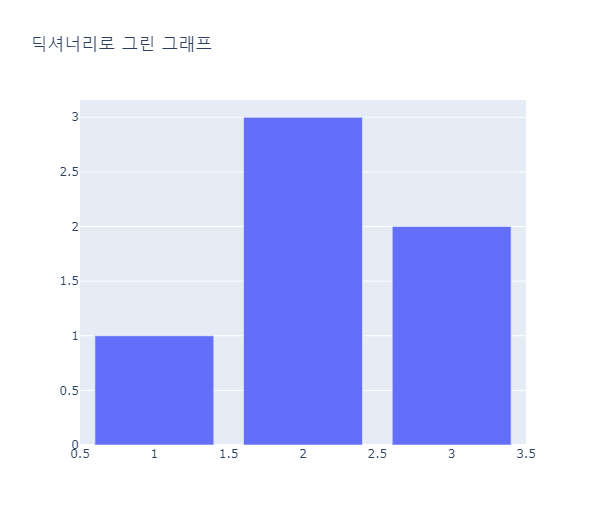
2) express를 통해서 그리는 방법
express는 seaborn과 비슷하게 각 그래프의 템플릿이 정해져있어서 원하는 그래프를 빠르게 그릴 수 있습니다.
express에도 다양한 옵션이 존재하고, 그리기 편리하기 때문에 매우 섬세하게 그리는 작업을 요하지 않는 경우에는 express를 통해 대부분 구현이 가능합니다.
tips = px.data.tips()

fig = px.scatter(tips, x = 'tip', y = 'total_bill', color = 'sex',
                title = 'Tips by Total Bill - Scatter Plot')
fig.show()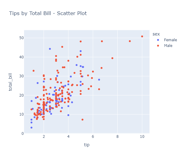
3) Graph_objects를 통해서 그리는 방법
Graph_objects의 약자인 go를 통해서 Figure객체를 선언하고 Figure내에 필요한 Data와 Layout등을 설정합니다.
섬세한 커스터마이징이 가능하며, 그래프를 겹쳐그리는 기능을 제공합니다.
- Graph_objects의 기본 구성
- go.Figure
- data: 데이터에 관한 정보
- layout: 제목, 폰트, 축, 범례 등 레이아웃 설정 정보
- go.update_layout: 레이아웃에 담지못한 정보가 있다면 추가 업데이트 가능
- go.add_trace: 시각요소 추가 삽입(subplot, map, 추가 그래프 등)
- go.make_subplots: 다중 그래프 그리기
fig = go.Figure(
    #데이터에 관한 정보를 지정
    data = [go.Histogram(name = 'Tips per Size',  #데이터명
                        x = tips['size'], y = tips['tip'],
                        hoverlabel = dict(bgcolor = 'white'))], #마우스를 올렸을 때 뜨는 정보창의 배경 설정
    # layout 파트에서 그래프의 축, 범례 등 부가정보 기입
    layout = go.Layout(
        title = 'Tips 그래프',
        xaxis = dict(title = '방문 인원 수',  #x축 설정
                    titlefont_size = 20, tickfont_size = 10),
        yaxis = dict(title = '전체 금액',  #y축 설정
                    titlefont_size = 15, tickfont_size = 10),
        bargroupgap = 0.3)  #막대간의 거리 조절
    )
fig.show()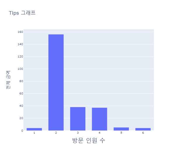
1. Scatter Plot
px.scatter(df, x = 'x', y = 'y') 형식으로 그릴 수 있습니다.
특정 칼럼의 값에 따라 색깔을 구분하여 표현하고 싶을 때는 color 옵션을 사용해줍니다.
fig = px.scatter(iris, x = 'petal_width', y = 'petal_length', color = 'species')
fig.show()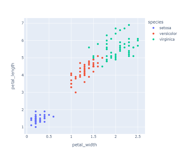
추가적으로 지정해줄 수 있는 파라메터들은 다음과 같습니다.
- hover_data = [] : 참고할 데이터 추가, data.columns로 설정하면 다 보여줍니다.
- hover_name : 마우스를 갖다댔을 때 나오는 정보들 중 메인으로 표시할 데이터를 지정합니다.
- title : 그래프 타이틀 지정
- symbol = data[column] : 마커 모양을 다르게 지정할 칼럼을 명시합니다.
- symbol_sequence = [] : 마커 모양을 지정해줍니다.
- color_discrete_sequence = [] : 마커 색깔을 지정해줍니다.
- size : 특정 칼럼의 값에 따라 점의 크기를 지정합니다.
fig = px.scatter(iris, x = 'petal_width', y = 'petal_length', color = 'species',
                hover_data = ['sepal_width'], # 참고할 데이터 추가 - iris.columns로 설정하면 다 보여줌
                hover_name = 'species',
                title = 'Iris Data - Scatter Plot',
                symbol = iris['species'],
                symbol_sequence = ['circle-open', 'circle', 'circle-open-dot'],  # 마커 모양 지정
                color_discrete_sequence = ['blue', 'orange', 'green'])  # 마커 모양 지정
fig.show()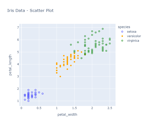
산점도에서 점의 크기를 다르게 표현하면 버블차트가 됩니다.
버블차트를 만들어주기 위해서는 size옵션을 지정해주면 됩니다.
#petal_length의 크기에 따라 점의 크기를 다르게 표현
fig = px.scatter(iris, x = 'petal_width', y = 'petal_length', size = 'petal_length', color = 'species')
fig.show()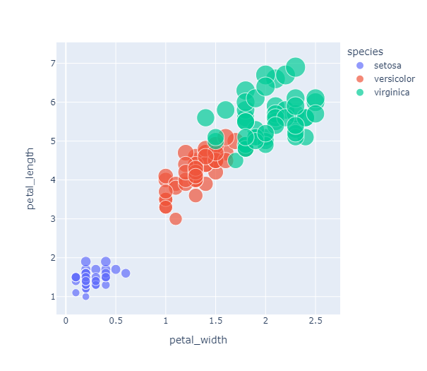
그래프를 특정 칼럼의 값에 따라 나눠서 그리고 싶다면
facet_row = 'column' 혹은 facet_col = 'column' 옵션을 사용합니다.
한 row 혹은 column에 들어가는 그래프의 수는 facet_row_wrap = n , facet_col_wrap = n 옵션을 사용합니다.
fig = px.scatter(tips, x = 'total_bill', y = 'tip', color = 'sex', facet_col = 'day')
fig.show()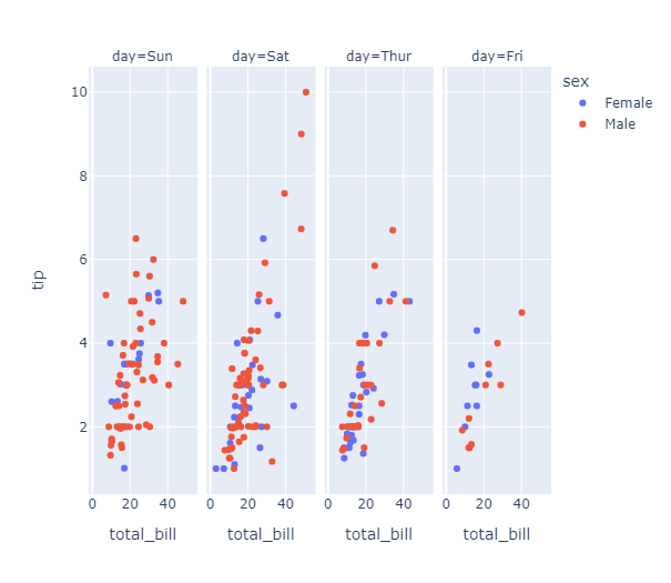
산점도를 좀 더 특징적으로 만들 수 있는 다양한 옵션들이 존재합니다.
log_x = True : 로그 스케일을 적용해 축 간격을 조정하고 %변화를 반영할 수 있습니다.
trendline = 'ols' or 'lowess' : 회귀선을 함께 그려줍니다.
size_max = n : 점의 최대 크기를 선택하여 전체적인 점의 크기를 조정할 수 있습니다.
국가별 정보가 담겨있는 gapminder 데이터를 가져와서
2007년의 gdp에 따른 대륙별 기대수명을 확인해보고 위 옵션들을 적용해줍니다.
#2007년의 gpd에 따른 대륙별 기대수명, 점의 크기는 인구 수
gapminder = px.data.gapminder()
gap2007 = gapminder[gapminder['year'] == 2007]  #2007년 데이터 추출

px.scatter(gap2007, x = 'gdpPercap', y = 'lifeExp', color = 'continent',
          size = 'pop', hover_name = 'continent',
          title = '2007년의 대륙별 기대수명')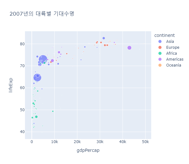
#log scale을 적용하고 회귀선을 함께 표현한 그래프
px.scatter(gap2007, x = 'gdpPercap', y = 'lifeExp', color = 'continent',
          size = 'pop', hover_name = 'continent', log_x = True, trendline = 'ols',
          title = '2007년의 대륙별 기대수명')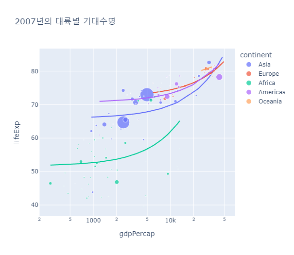
go.Scatter를 이용해서 산점도를 그리는 방법은 아래와 같습니다.
#go.Figure로 버블차트 그리기
fig = go.Figure(data = go.Scatter(x = [1,2,3,4,5],
                                  y = [11, 12, 13, 14, 15],
                                  mode = 'markers',  #산점도로 그려줌
                                  marker = dict(size = [20, 40, 60, 80, 100],
                                                color = [1, 2, 3, 4, 5])))
fig.show()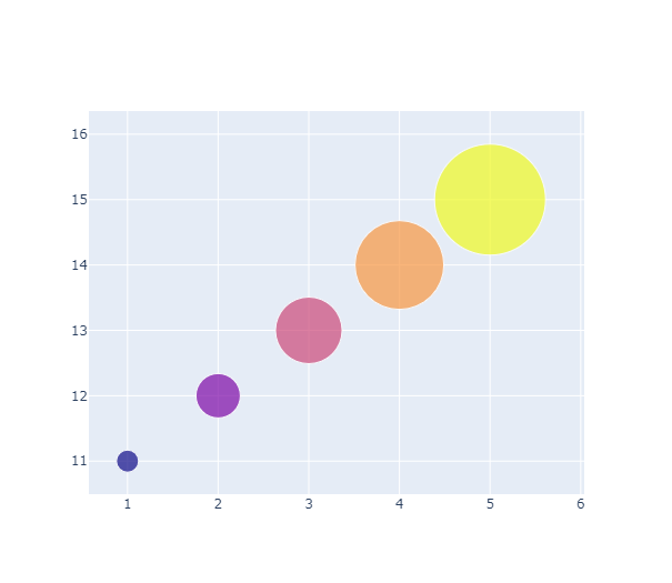
#go.Figure로 산점도 그려보기
fig = go.Figure(data = go.Scatter(
    x = iris['petal_width'],
    y = iris['petal_length'],
    mode = 'markers',
    marker = dict(size = 20, color = iris['sepal_length'],
                 line_width = 1)
    ))
fig.update_layout(title = 'Iris Data')
fig.show()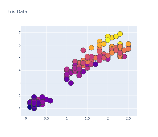
2. Line Graph
px.line(df, x = 'x', y = 'y') 형식으로 그릴 수 있습니다.
특정 칼럼의 값에 따라 색깔을 구분하여 표현하고 싶을 때는 color 옵션을 사용해줍니다.
#아시아인의 년도별 기대수명
gapAsia = px.data.gapminder().query('continent == "Asia"')  #px.data에서는 내부적으로 쿼리를 제공

px.line(gapAsia, x = 'year', y = 'lifeExp', color = 'country')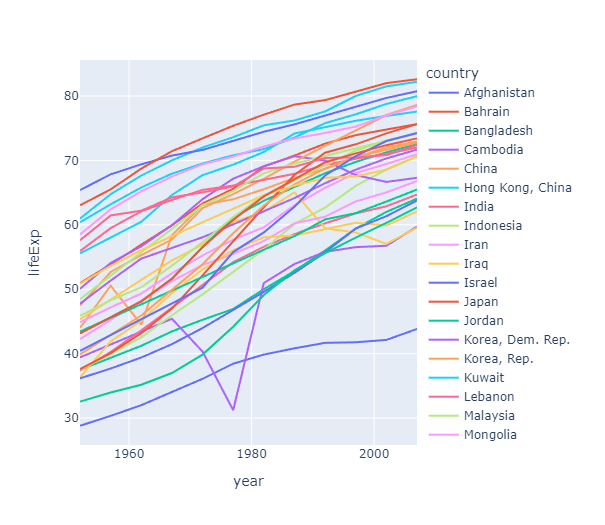
라인 그래프의 대표적인 활용 분야는 시계열 그래프입니다.
시계열 그래프를 그리기 위해 삼성전자의 주식 데이터를 가져와서 시간에 따른 종가 변화 그래프를 그려봅니다.
import yfinance as yf

samsung = yf.download('005930.KS', start = '2012-07-30', end = '2022-07-30',
                     progress = False)
samsung.reset_index(inplace = True)

#시계열 그래프
px.line(samsung, x= 'Date', y = 'Close')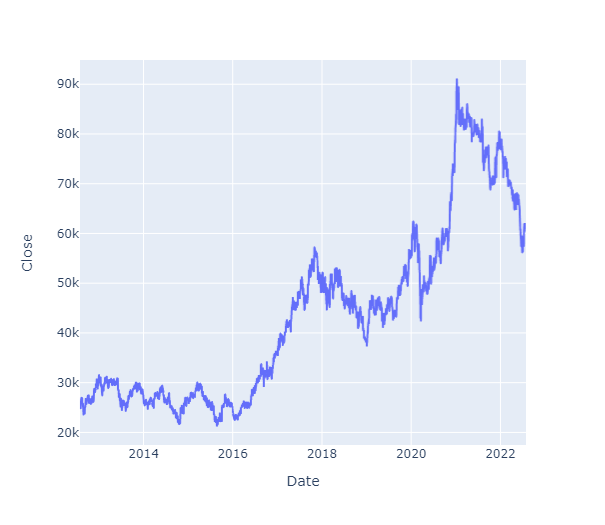
range_x = [] 혹은 range_y = [] 옵션을 통해 x축과 y축의 범위를 지정할 수 있습니다.
혹은 축 범위를 조정하며 그래프를 살펴볼 수 있는 rangeslider_visible옵션을 사용할 수 있습니다.
#x축 범위(날짜) 수정
px.line(samsung, x = 'Date', y = 'Close', range_x = ['2016-07-01', '2022-07-24'])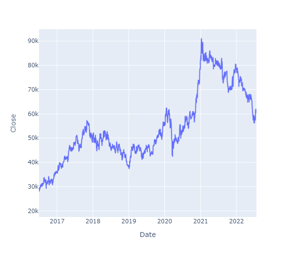
#축 범위를 조정하며 그래프를 살펴볼 수 있는 rangeslider_visible옵션 사용
fig = px.line(samsung, x = 'Date', y = 'Close')
fig.update_xaxes(rangeslider_visible = True)
fig.show()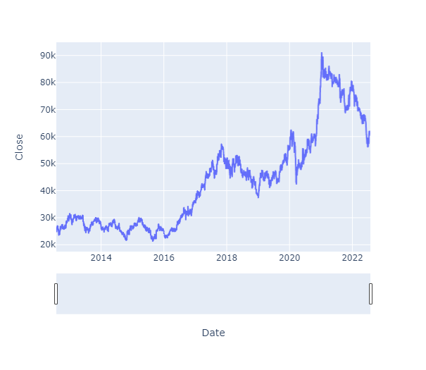
plotly에서는 주식의 변동성을 보여주는 금융 차트인 캔들스틱 차트를 go.Candlestick을 통해 그릴 수 있습니다.
fig = go.Figure(data = [go.Candlestick(x = samsung['Date'],
                                      open = samsung['Open'],
                                      high = samsung['High'],
                                      low = samsung['Low'],
                                      close = samsung['Close'])])
fig.show()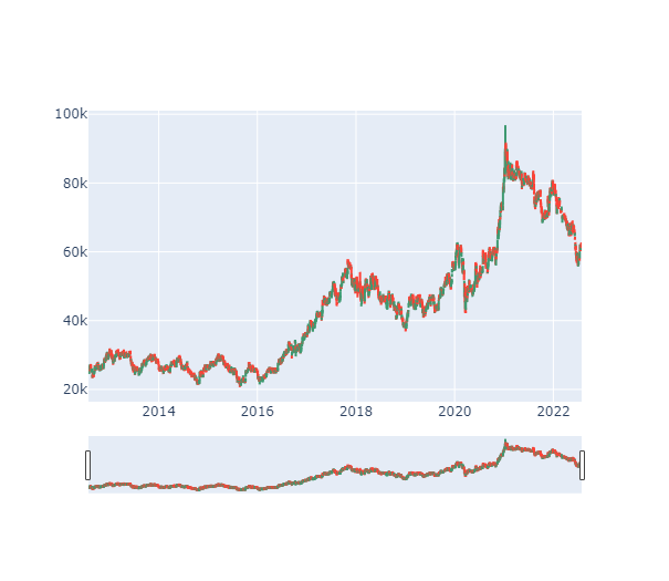
3. Bar Chart
px.bar(data, x = 'x', y = 'y')
#캐나다의 년도별 인구수
canada = gapminder[gapminder['country'] == 'Canada']

fig = px.bar(canada, x = 'year', y = 'pop',
            title = 'Population in Canada')
fig.show()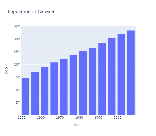
그래프를 가로로 그리고 싶다면 orientation = 'h'를 이용합니다.
fig = px.bar(canada, x = 'year', y = 'pop', title = 'Population in Canada',
            hover_data = ['gdpPercap', 'lifeExp'],
            orientation = 'h')
fig.show()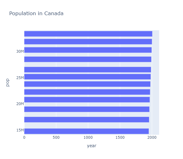
바 그래프에서도 특정 변수에 따른 막대 색을 지정(color)하거나, 축 라벨(labels) 설정도 가능합니다.
#특정 변수에 따른 막대 색 지정, 축 라벨 설정도 가능
fig = px.bar(canada, x = 'year', y = 'pop', title = 'Population in Canada',
            hover_data = ['gdpPercap', 'lifeExp'],
            color = 'lifeExp', labels = {'pop': '캐나다 총 인구 수', 'year': '연도'})
fig.show()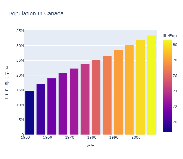
바 그래프에는 애니메이션을 줄 수 있는 옵션들이 존재합니다.
animation_frame = 'col'에 시간 등 변화의 기준을 담은 칼럼을 입력하고,
animation_group = 'col'에 변화를 보고싶은 칼럼을 입력합니다.
#애니메이션을 통해 시간의 흐름에 따른 지표의 변화를 그릴 수 있음
#시간의 흐름에 따른 대륙별 인구 수 그래프
fig = px.bar(gapminder, x = 'continent', y = 'pop', color = 'continent',
            animation_frame = 'year', range_y = [0, 4000000000],
            animation_group = 'country', hover_name = 'country')
fig.show()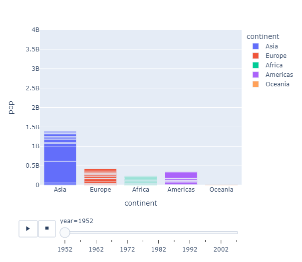
#국가별(animation_group)로 분류되어있는 막대를 합쳐서 깔끔하게 그리고 싶다면 histogram을 이용
fig = px.histogram(gapminder, x = 'continent', y = 'pop', color = 'continent',
            animation_frame = 'year', range_y = [0, 4000000000],
            animation_group = 'country')
fig.show()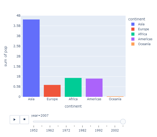
기본적으로 바그래프에서 color로 x나 y가 아닌 칼럼을 사용할 경우 하나의 막대에서 color를 나눠서 표현해줍니다.
색이 다른 막대를 따로따로 그리고 싶다면 barmode = 'group'을 사용합니다.
df1=pd.DataFrame({'store':['Costco','Costco','Costco','Lotte Mart','Lotte Mart','Lotte Mart',"E-mart","E-mart","E-mart"],
               'product':['Potato','Onion','Cucumber','Potato','Onion','Cucumber','Potato','Onion','Cucumber'],
               'price':[3000,1600,2600,3200,1200,2100,2000,2300,3000],
                'quantity':[25,31,57,32,36,21,46,25,9]})

fig = px.bar(df1, x = 'store', y = 'price', color = 'product', barmode = 'group')
fig.show()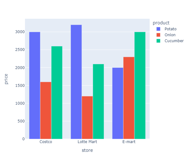
#melt로 데이터 형태 변환한 후 그래프 그리기
df2 = df1.melt(id_vars = ['product', 'store'], value_vars = ['price', 'quantity'],
              var_name = 'product_info', value_name = 'product_value')
              df2_1 = df2[df2['product_info'] == 'price']

fig = px.bar(df2_1, x = 'store', y = 'product_value', color = 'product',
            barmode = 'group')
fig.show()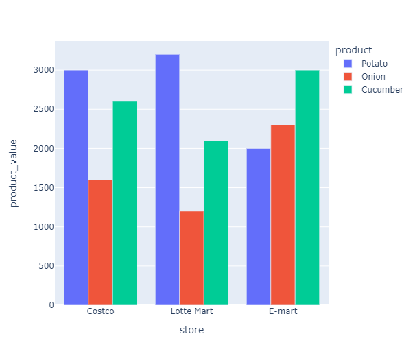
특정 기준에 따라 그래프를 각각 쪼개서 그리고싶다면 facet_col, facet_row를 사용합니다.
#store에 따라 그래프 쪼개서 그리기
fig = px.bar(df2_1, x = 'product', y = 'product_value', color = 'product',
            facet_col = 'store')
fig.show()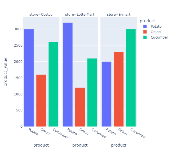
바 그래프에서 x값에 대해 y값이 하나씩 대응되지 않는 경우에는 x에 대한 y의 값을 모두 합하여 그려줍니다.
#시간대별 성별에 따른 total_bill의 합계
#히스토그램을 사용하여 합계를 하나의 막대로 표현(barplot은 개별 값들로 구분하여 표현)
fig = px.histogram(tips, x = 'sex', y = 'total_bill', facet_col = 'time',
            color = 'sex')
fig.show()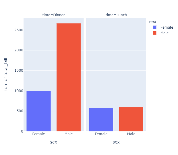
#날짜와 시간에 따라 나누어 성별과 흡연여부에 따른 total_bill의 합계 그래프 그리기
fig = px.histogram(tips, x = 'sex', y = 'total_bill', color = 'smoker',
                  facet_col = 'day', facet_row = 'time', barmode = 'group',
                  category_orders = {'day': ['Thur', 'Fri', 'Sat', 'Sun'],
                                    'time': ['Lunch', 'Dinner']})  #그래프 순서 지정
fig.show()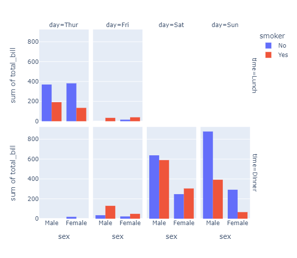
4. Histogram
히스토그램 값에 y축을 입력하면 합하여 바 그래프와 유사한 모양으로 보여주지만,
y축을 입력하지 않으면 x값의 분포를 그려줍니다.
px.histogram(data, x = 'x', y = 'y', nbins = n) #nbins는 구간의 개수
#총 결제금액의 분포
fig = px.histogram(tips, x = 'total_bill', nbins = 40)  #구간의 개수 지정, 지정하지 않으면 최적화된 값을 보여줌
fig.show()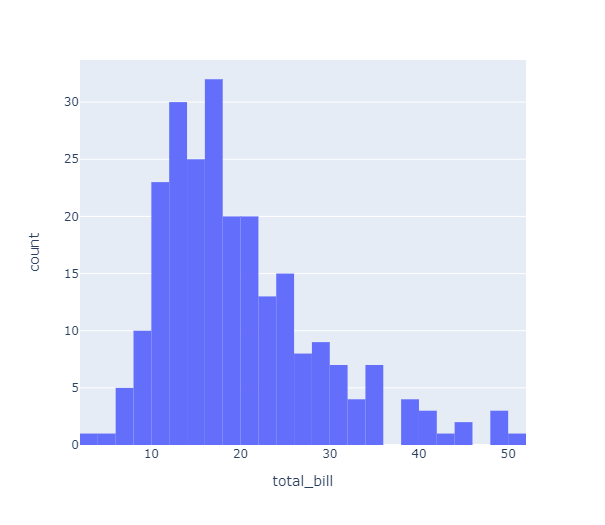
#성별에 따른 총 결제금액의 분포
fig = px.histogram(tips, x = 'total_bill', nbins = 30,
                  color = 'sex', color_discrete_sequence = ['blue', 'red'],  #성별에 따라 색 다르게 지정
                  opacity = 0.6)  #투명도 조정
fig.show()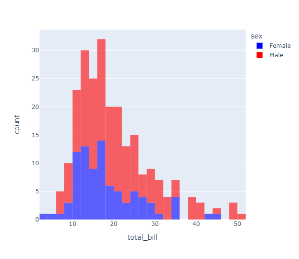
히스토그램에 x와 y값을 입력하고 histfunc을 지정하면 간단한 연산을 수행하고 그래프로 표현할 수 있습니다.
#total_bill에 따른 팁의 평균값 분포
fig = px.histogram(tips, x = 'total_bill', y = 'tip', histfunc = 'avg')
fig.show()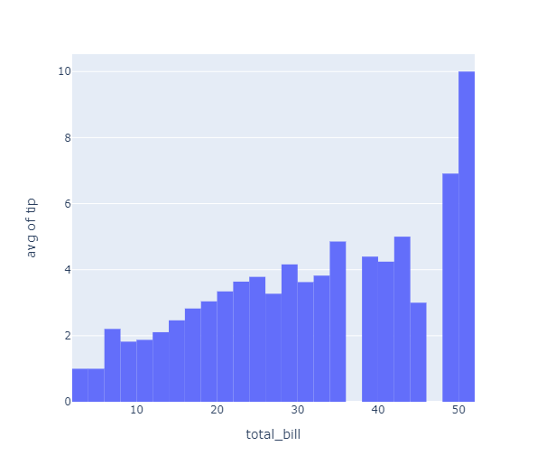
marginal 옵션을 이용하면 부가 그래프를 그려 다차원 탐색을 할 수 있습니다.
marginal = 'rug' or 'box' or 'violin'
fig = px.histogram(tips, x = 'total_bill', marginal = 'violin')
fig.show()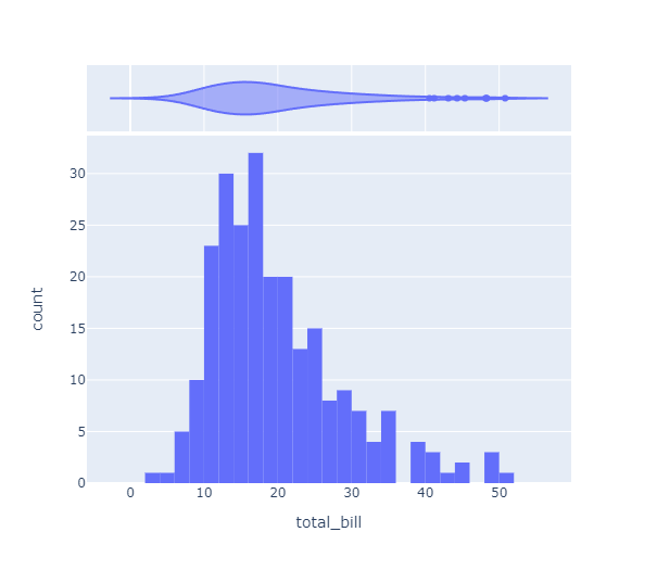
5. Box plot & Violin plot
px.box(data, x = 'x', y = 'y')
px.violin(data, x = 'x', y = 'y')
#붓꽃 종에따른 sepal_length의 boxplot
#points = 'all' 옵션을 주면 실제 값들을 점으로 같이 그려줌
fig = px.box(iris, x = 'species', y = 'sepal_length', points = 'all')
fig.show()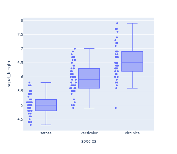
color, facet_col을 이용해 다양한 기준으로 그래프를 나누어 그릴 수 있습니다.
#박스플랏을 요일별로 나눠서 그리기 - facet_col, facet_row
fig = px.box(tips, x = 'sex', y = 'total_bill', color = 'sex',
            facet_col = 'day', category_orders = {'day': ['Thur', 'Fri', 'Sat', 'Sun']})
fig.show()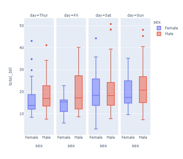
바이올린 플랏은 px.box대신 px.violin에 동일한 방식으로 값을 입력하여 사용할 수 있습니다.
fig = px.violin(tips, x = 'time', y = 'total_bill', points = 'all', color = 'sex')
fig.show()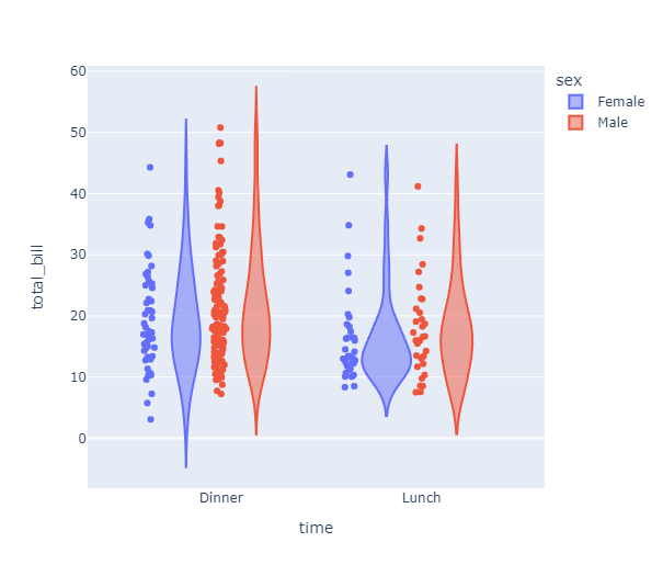
box = True 옵션을 통해 바이올린 플랏 내에 박스플랏을 그려줄 수 있습니다.
fig = px.violin(tips, x = 'time', y = 'total_bill', color = 'sex', box = True)
fig.show()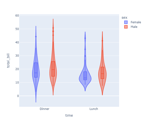
6. Pie Chart
df = px.data.gapminder().query('year == 2007').query('continent == "Americas"')

fig = px.pie(df, values = 'pop', names = 'country',
            title = 'Population of American continent')
fig.update_traces(textposition = 'inside', textinfo = 'percent + label')
fig.show()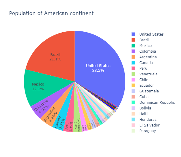
7. Treemap(트리맵)
계층 구조의 데이터를 표시하는데 적합한 차트 중 하나입니다.
트리맵에서의 넓이는 범위의 크기나 영역의 크기를 주로 나타냅니다.
#path에 큰 범주(열)부터 작은 범주를 순서대로 넣어줍니다.
fig = px.treemap(tips, path = [px.Constant('all'), 'sex', 'day', 'time'],
                values = 'total_bill', color = 'time',
                color_discrete_map = {'(?)': 'lightgrey', 'Lunch': 'gold', 'Dinner': 'darkblue'})
fig.update_layout(margin = dict(t = 50, l = 25, r = 25, b = 25))
fig.show()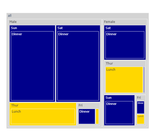
8. Scatter Matrix(산점도 행렬)
px.scatter_matrix(gap2007) #seaborn의 pairplot과 같습니다.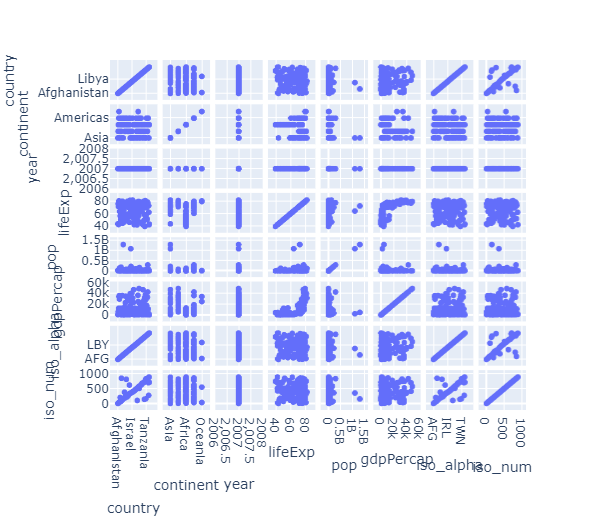
10. 그래프 꾸미기 옵션
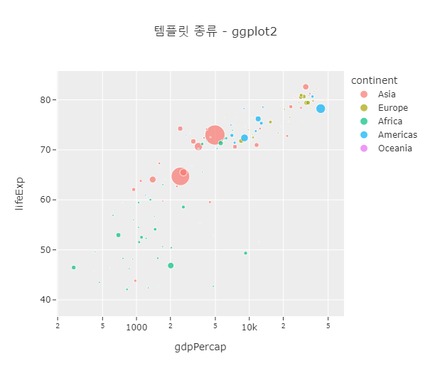
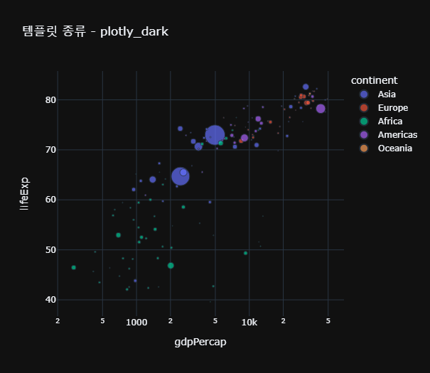
1) 템플릿 설정
plotly에서 제공하는 템플릿 종류는 pio.templates에 담겨있습니다.
Templates configuration
-----------------------
    Default template: 'plotly'
    Available templates:
        ['ggplot2', 'seaborn', 'simple_white', 'plotly',
         'plotly_white', 'plotly_dark', 'presentation', 'xgridoff',
         'ygridoff', 'gridon', 'none']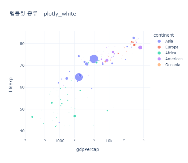
2) 높이, 너비 및 여백 조정
fig.update_layout(margin = dict(l = n, r = n, t = n, b = n, pad = n), paper_bgcolor = color)
#template = 'plotly_dark'
fig = px.scatter(gap2007, x = 'gdpPercap', y = 'lifeExp', size = 'pop',
                color = 'continent', log_x = True,
                 template = 'plotly_dark',
                title = '높이, 너비 및 여백 조정')
fig.update_layout(margin = dict(l = 10, r = 30, t = 50, b = 30), paper_bgcolor = 'skyblue')
fig.show()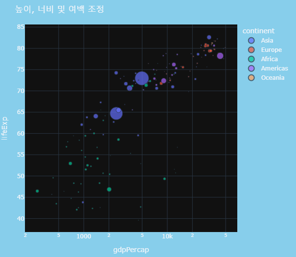
3) 눈금(Tick) 형식 지정
fig.update_layout(xaxis = dict())
- 연속형일 경우 tickmode = 'linear'
tick0 = 시작점
dtick = 눈금 간격
- 범주형일 경우 tickmode = 'array'
tickvals = [] #축 값 입력
ticktext = [] #그래프에 표시할 축 값
- 시계열 데이터의 경우 날짜 포맷을 지정할 수 있습니다.
fig.update_layout(xaxis_tickformat = '%d %B (%a)<br>%Y')
4) 축 제목 및 빈도 표시 설정
- 축 제목(label)
px.scatter(labels = {'column' : '표시할 label'}) 으로 지정해줄 수 있습니다.
- 바 그래프에서 막대의 값 표시
px.bar(text_auto = '숫자 형식 지정')을 통해 원하는 형식으로 빈도를 출력할 수 있습니다.
fig.update_traces(textposition = 'outside')는 막대 위에 빈도를 표시합니다.
df = px.data.gapminder().query("continent == 'Europe' and year == 2007 and pop > 2.e6")
fig = px.bar(df, y='pop', x='country', text_auto = True,
            title="Default: various text sizes, positions and angles")
fig.show()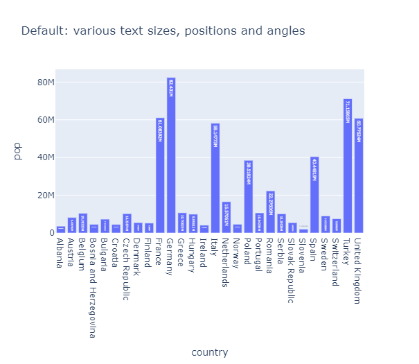
11. 그래프 여러개 그리기
1-1) 그래프 겹쳐서 그리기
기본적으로 fig = go.Figure()로 도화지를 설정해주고
fig.add_trace()를 이용해 도화지 위에 그래프를 하나씩 올려주는 방식으로 만듭니다.
t = np.linspace(0, 10, 100)
y1 = np.random.randn(100).cumsum()
y2 = np.random.randn(100).cumsum()
y3 = np.random.randn(100).cumsum()

fig = go.Figure()  #도화지를 만들어주고

#그래프를 하나씩 올려줍니다.
fig.add_trace(go.Scatter(x=t, y=y1, name='markers', mode='markers', marker_color='darkred'))
fig.add_trace(go.Scatter(x=t, y=y2, name='lines+markers', mode='lines+markers', marker_color='darkblue'))
fig.add_trace(go.Scatter(x=t, y=y3, name='lines', mode='lines', marker_color='darkgreen'))
fig.show()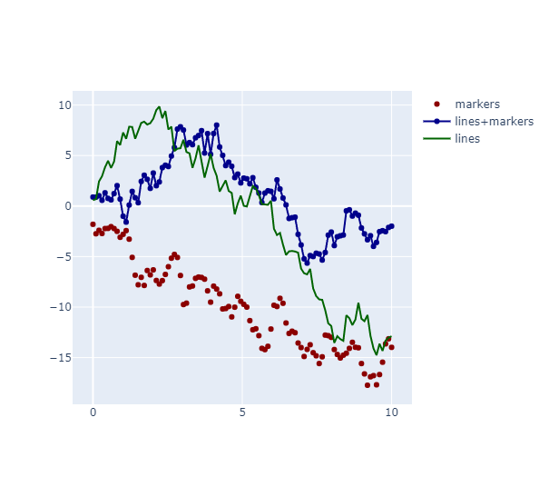
1-2) 축 여러개 설정(Multiple Axes)
#2번째 y축을 만들겠다고 설정해줍니다.
fig = make_subplots(specs = [[{'secondary_y': True}]])

#그래프를 하나씩 그려줍니다.
fig.add_trace(
    go.Scatter(x = [1,2,3], y = [40,50,60], name = 'yaxis data'),
    secondary_y = False)

fig.add_trace(
    go.Scatter(x = [2,3,4], y = [4,5,6], name = 'yaxis2 data'),
    secondary_y = True)

#축 label 달아주기
fig.update_yaxes(title_text = '<b>primary</b> yaxis title', secondary_y = False)
fig.update_yaxes(title_text = '<b>secondary</b> yaxis title', secondary_y = True)

fig.show()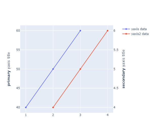
2) 서브플롯 그리기(Subplots)
- rows: 행의 갯수 (ex) 2)
- cols: 열의 갯수 (ex) 3)
- shared_xaxes: x축을 공유할지 여부 (True, False)
- shared_yaxes: y축을 공유할지 여부 (True, False)
- start_cell: 시작위치 정하기 (ex) "top-left")
- print_grid: 그리드 출력여부 (True, False)
- horizontal_spacing: 그래프간 가로 간격
- vertical_spacing: 그래프간 가로 간격
- subplot_titles: 플롯별 타이틀
- column_widths: 가로 넓이
- row_heights: 세로 넓이
- specs: 플롯별 옵션
- insets: 플롯별 그리드 레이아웃 구성
- column_titles: 열 제목
- row_titles: 행 제목
- x_title: x축 이름
- y_title: y축 이름
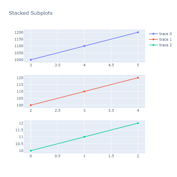
fig = make_subplots(rows =3, cols = 1)  #나눌 row와 col의 수 설정

#그래프 그리고 위치 지정해주기
fig.append_trace(go.Scatter(
    x=[3, 4, 5],
    y=[1000, 1100, 1200],
), row=1, col=1)

fig.append_trace(go.Scatter(
    x=[2, 3, 4],
    y=[100, 110, 120],
), row=2, col=1)

fig.append_trace(go.Scatter(
    x=[0, 1, 2],
    y=[10, 11, 12]
), row=3, col=1)

fig.update_layout(height=600, width=600, title_text="Stacked Subplots")
fig.show()